Forme
A coaching app designed for fitness professionals who need clarity — not complexity.
2025
Personal project · Mobile App · 6 weeks · Solo
Context & problem
Gymkee and most fitness apps are built around one user: the athlete who wants to track everything.
But coaches have a different job. They need to prepare sessions, guide clients, and track progress — without fighting the interface to do it.
Overcrowded dashboards. Redundant metrics. Navigation that interrupts the session instead of supporting it.
The frustration was real, observed directly through a coach's daily use of existing tools. The gap was clear enough to design around.
Problem Statement
How might we design a coaching tool that reduces cognitive load during sessions while keeping progress visible enough to motivate consistency?
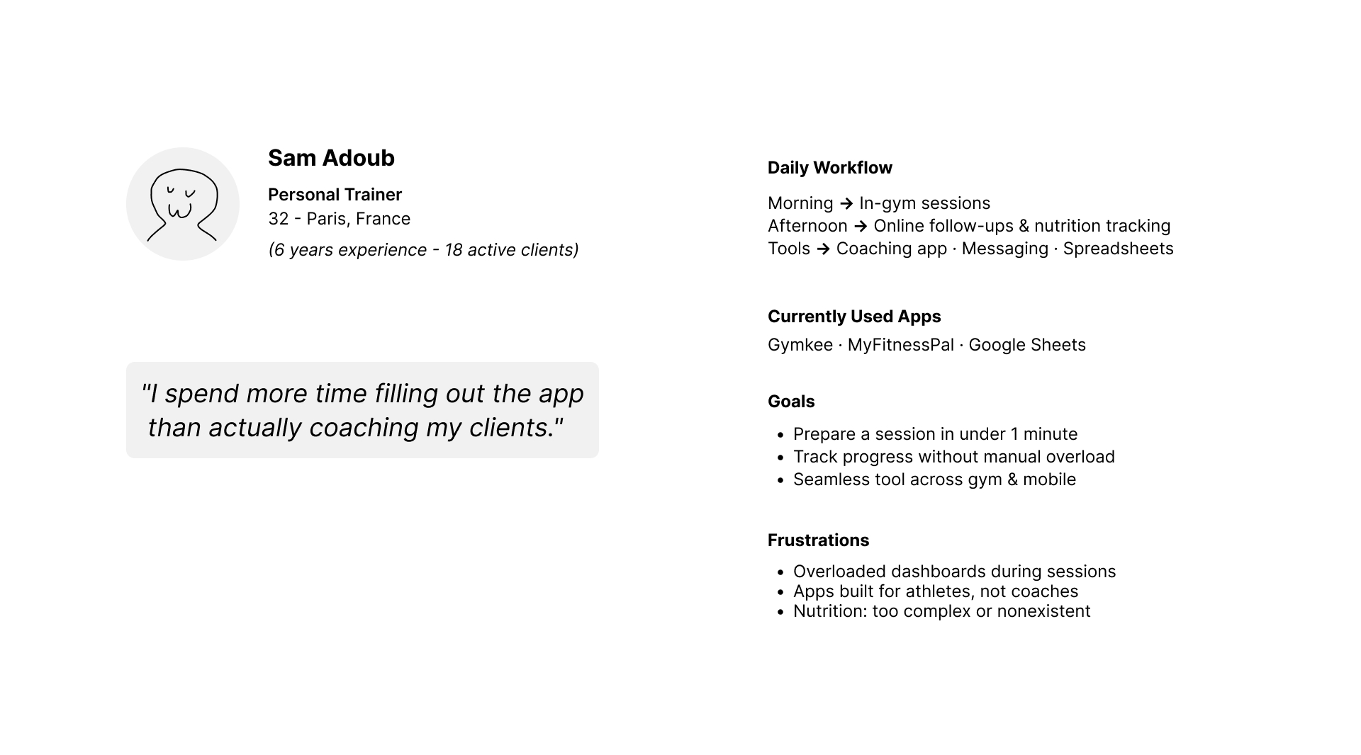
User
A fitness coach, 25–35 years old. Uses 1–2 apps daily to manage client sessions. Technically comfortable, but time-constrained. Core frustration: spends more time navigating the app than actually coaching. Not looking for more features. Looking for fewer obstacles.
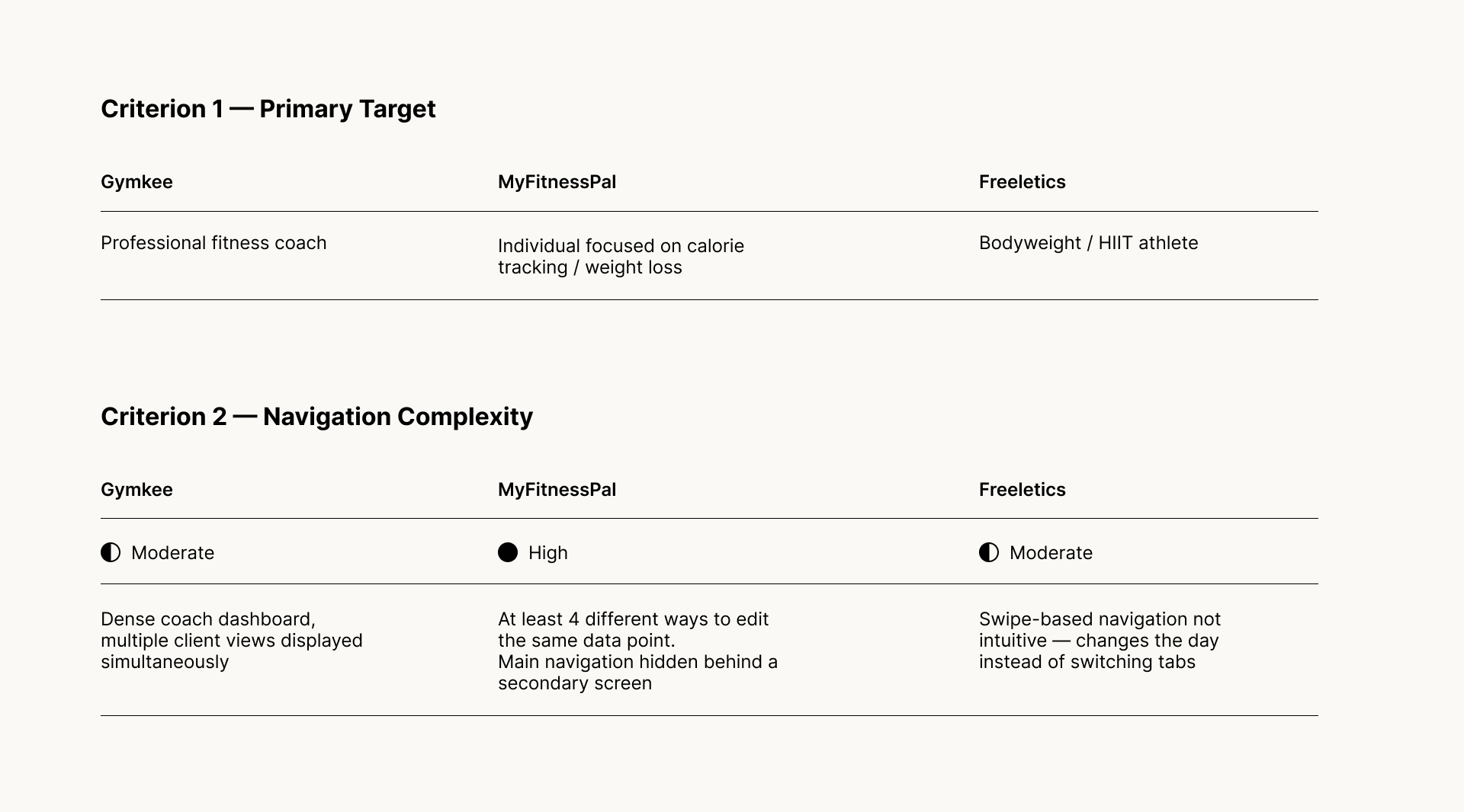
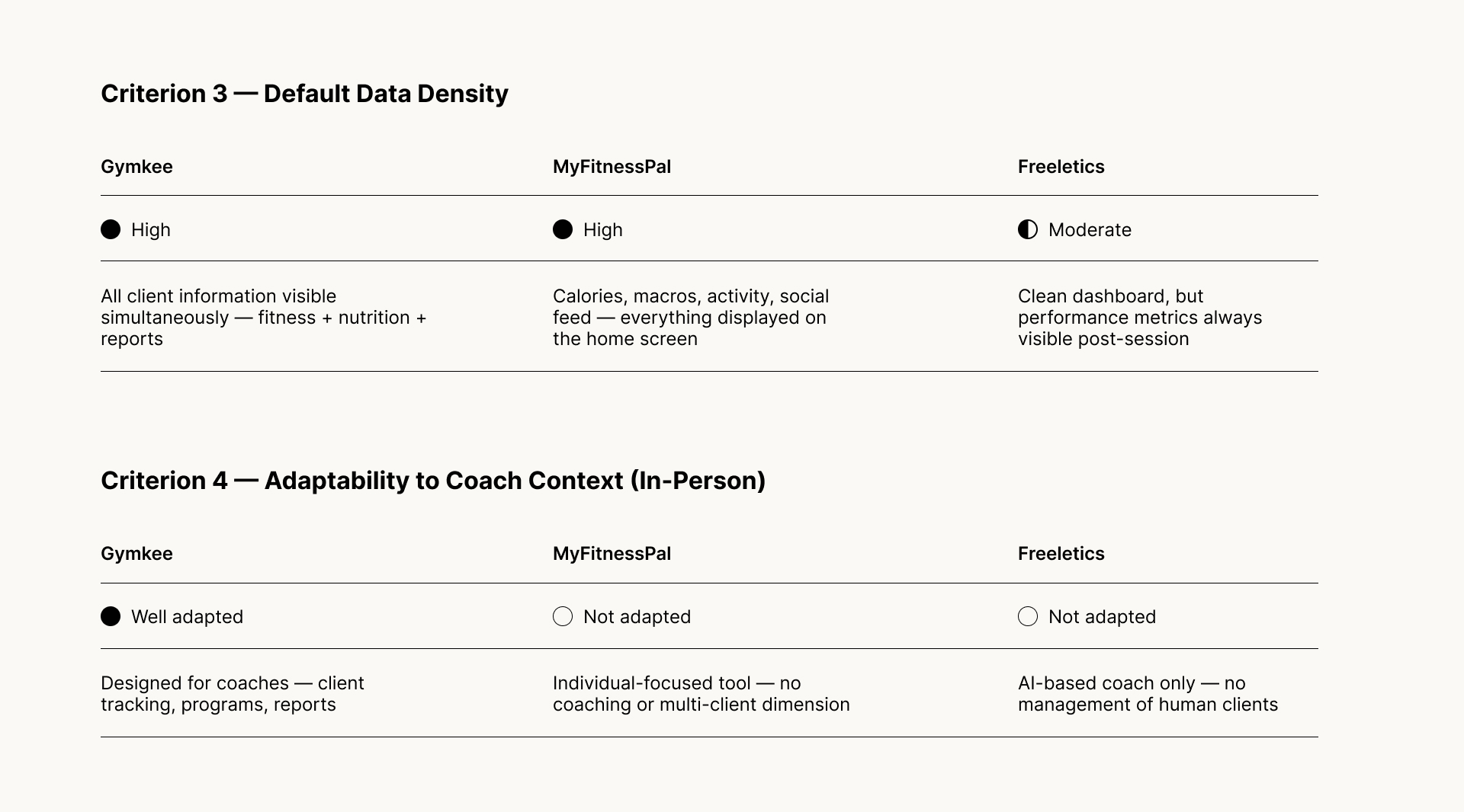
Benchmark
Three apps analysed: Gymkee, MyFitnessPal, Freeletics. Common pattern across all three: data density is treated as a feature, not a problem. Every screen competes for attention. Metrics are always visible, whether relevant or not. The interface assumes the user wants to measure everything. Key insight → Reducing visible data by default is not a loss of functionality. It's a design decision in favor of focus.
Design Intent
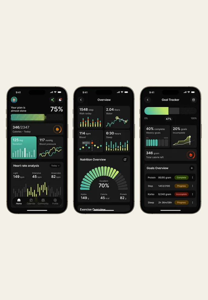
Forme is built around one principle: the interface should disappear during the session.
Less visible by default. Available on demand. Never in the way.
Experience structure
Three connected moments structure the entire experience. Prepare — designed to set up a session in under 60 seconds. Execute — nothing interrupts the effort. Reflect — progress is shown, not calculated.
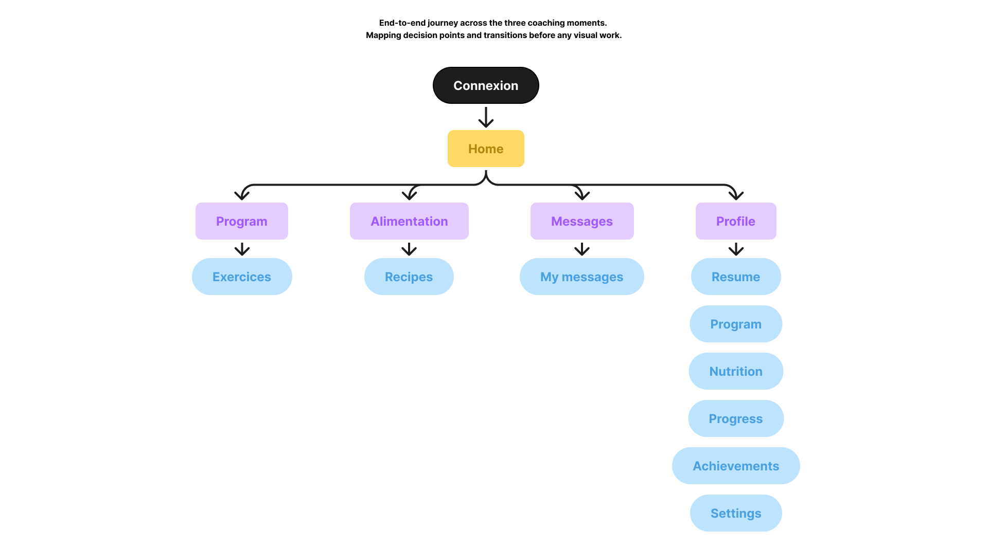
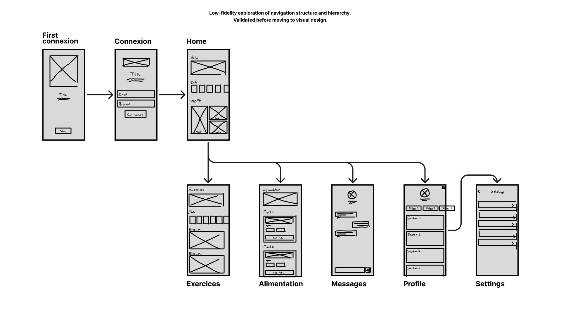
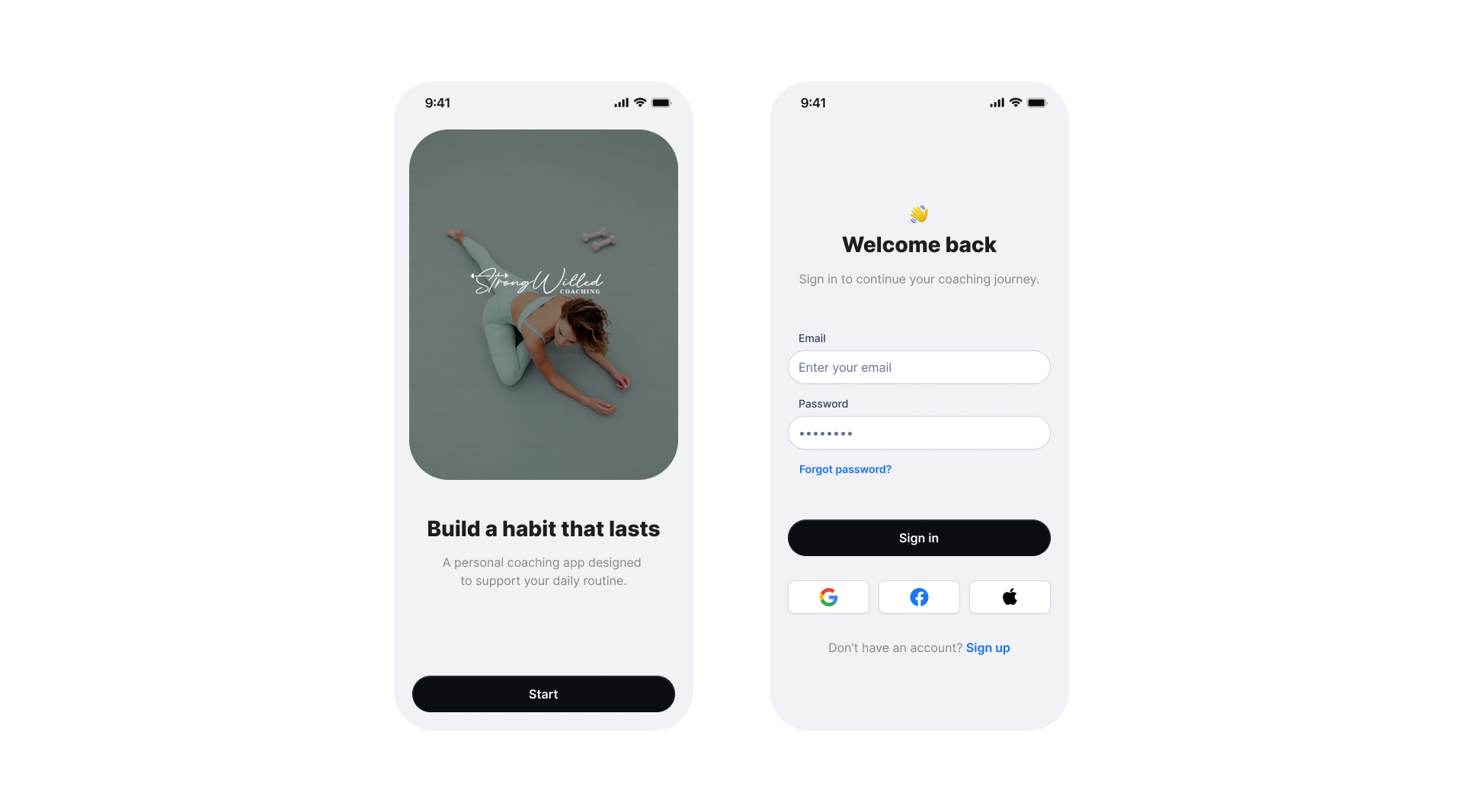
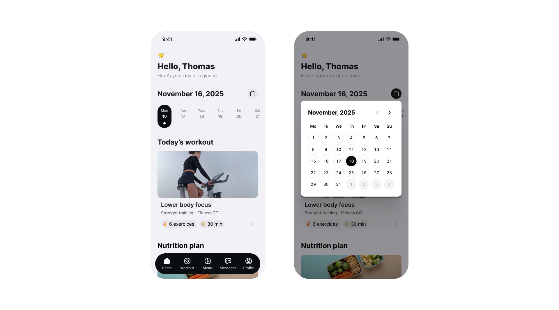
Entry Experience
Design decision → direct access to the dashboard from the first interaction. No forced setup.
KPI · Time to first action (time between app open and first coaching action taken)
Target → less than 60 seconds
If above 90s → identify friction points in the entry flow
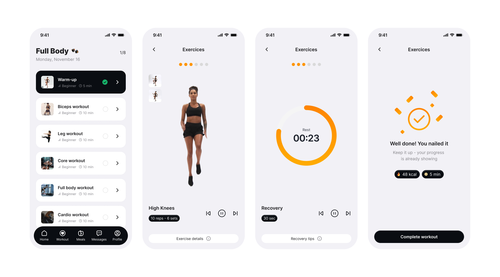
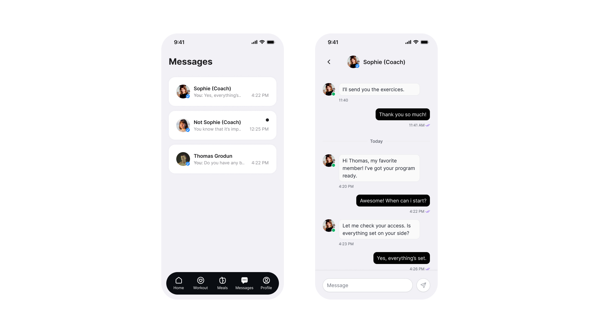
Workout Experience
During a session, the interface steps back.
Large controls. No competing information. The next action is always the most visible element on screen.
Design decision → remove all non-essential UI during active sessions.
KPI → Session completion rate (percentage of sessions started that are marked as done).
Target → > 65%. If below 50%: identify exit points through funnel analysis and redesign the interruption moments.
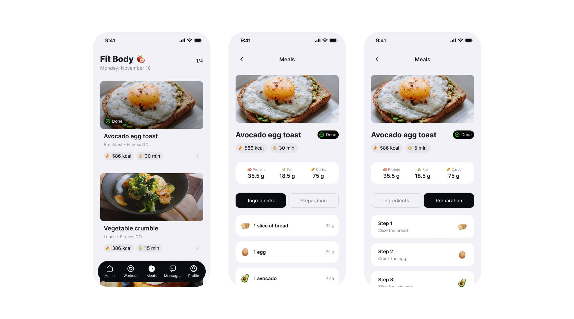
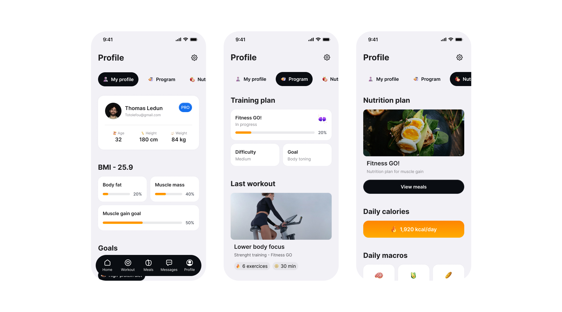
Meals & Nutrition
Nutrition is treated as guidance, not obligation. Information is revealed progressively — only when the coach or client initiates it.
No default calorie tracking. No logging pressure. Design decision → opt-in nutrition model, not opt-out.
KPI → Nutrition section engagement rate.
A low rate is expected and acceptable here — it confirms the opt-in model works for coaches who don't need daily tracking.
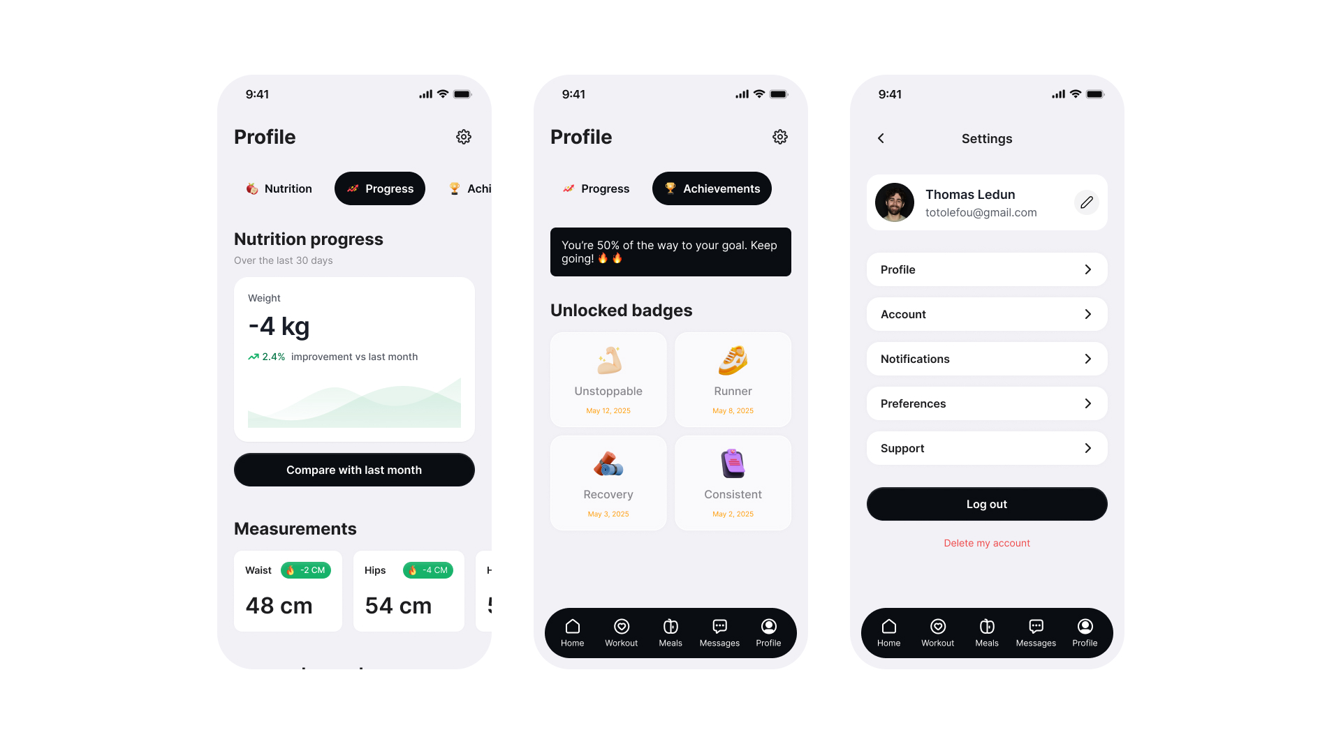
Feedback & Progress
Progress is shown through consistency, not performance.
Completed sessions. Maintained streaks. Steady habits. Not rankings. Not PRs. Not pressure.
Design decision → surface consistency signals over performance metrics.
KPI → D7 and D30 retention rates (percentage of users returning 7 and 30 days after first use).
Target → D7 > 40%, D30 > 20%. If D30 drops below 15%: re-evaluate whether the low-metric approach reads as motivating or as a lack of feedback.
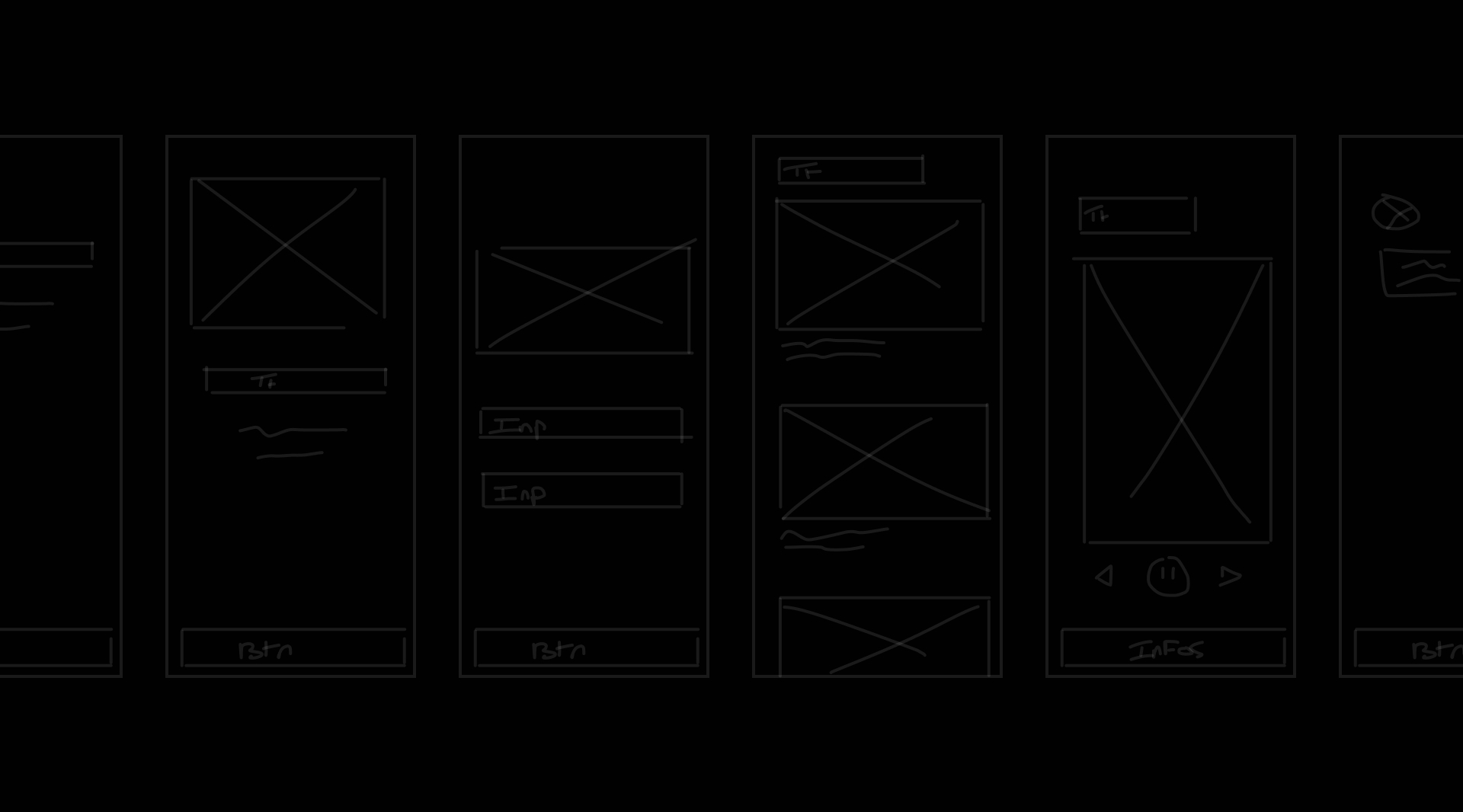
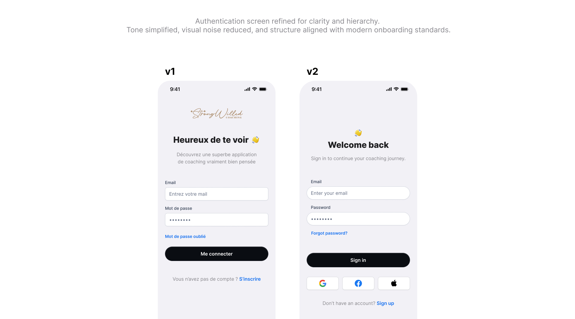
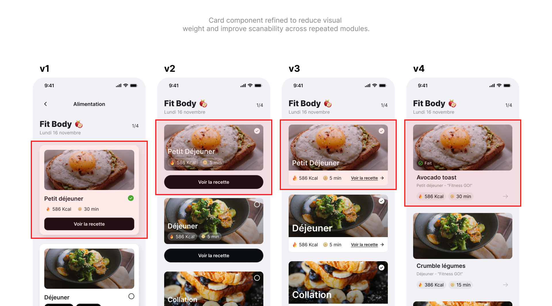
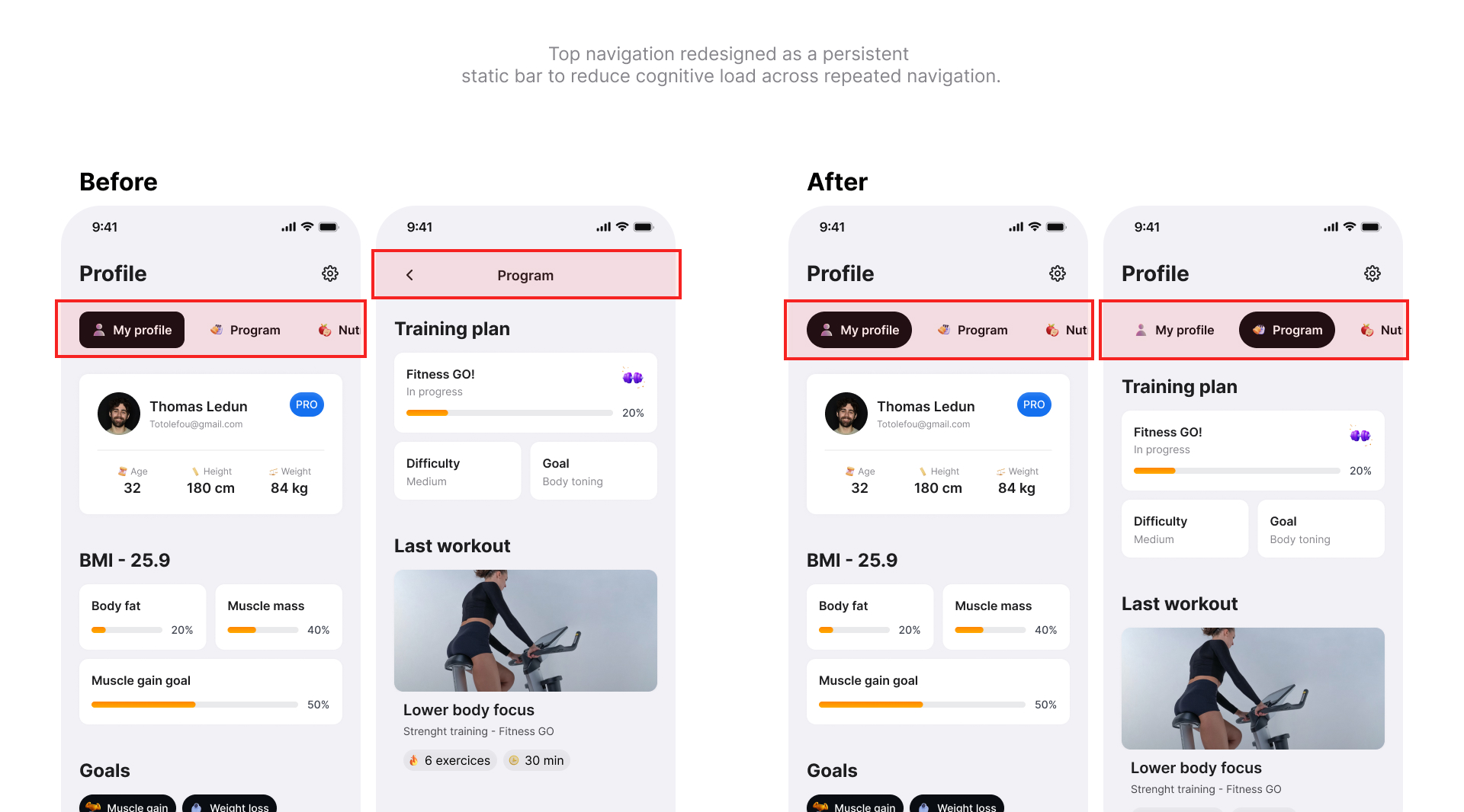
Design refinements
Three flows went through significant iteration.
Login → simplified to reduce entry friction.
Food logging → reframed from tracking to suggesting.
Profile → stripped to coaching-relevant information only.
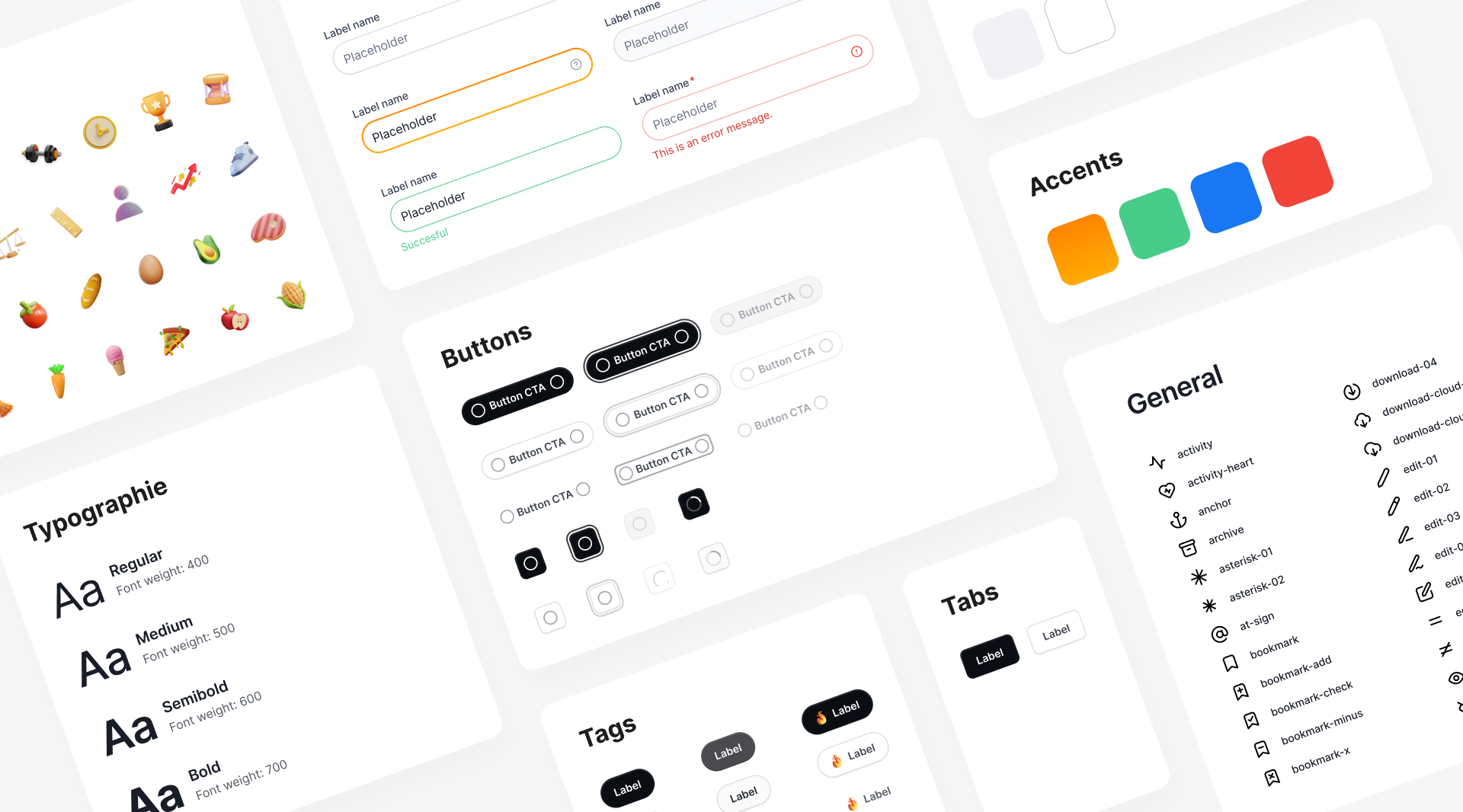
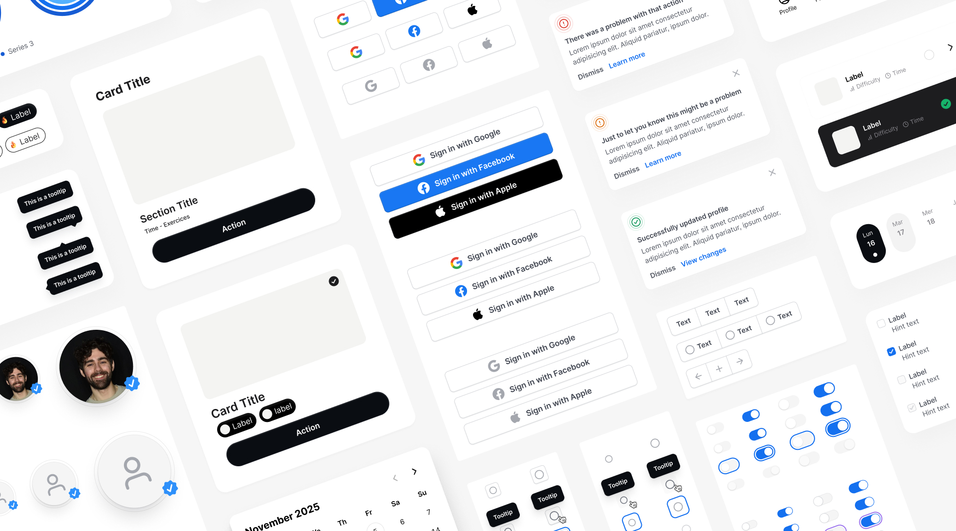
Visual system
A restrained visual language was the only coherent choice for a product built around focus. High contrast where action is required. Neutral space everywhere else. Consistency across components to reduce relearning at each screen.
Outcome
The hardest call: hide performance data by default.
Every existing fitness app does the opposite. It's the right decision for a coach whose job is to make the client feel capable — not measured.
Next step: user testing to validate whether the low-pressure framing reads as supportive or as a lack of ambition.
That's a product question. And the right one to ask.